Satycation Art #11: Don’t be Fooled by Simultaneous Contrast!


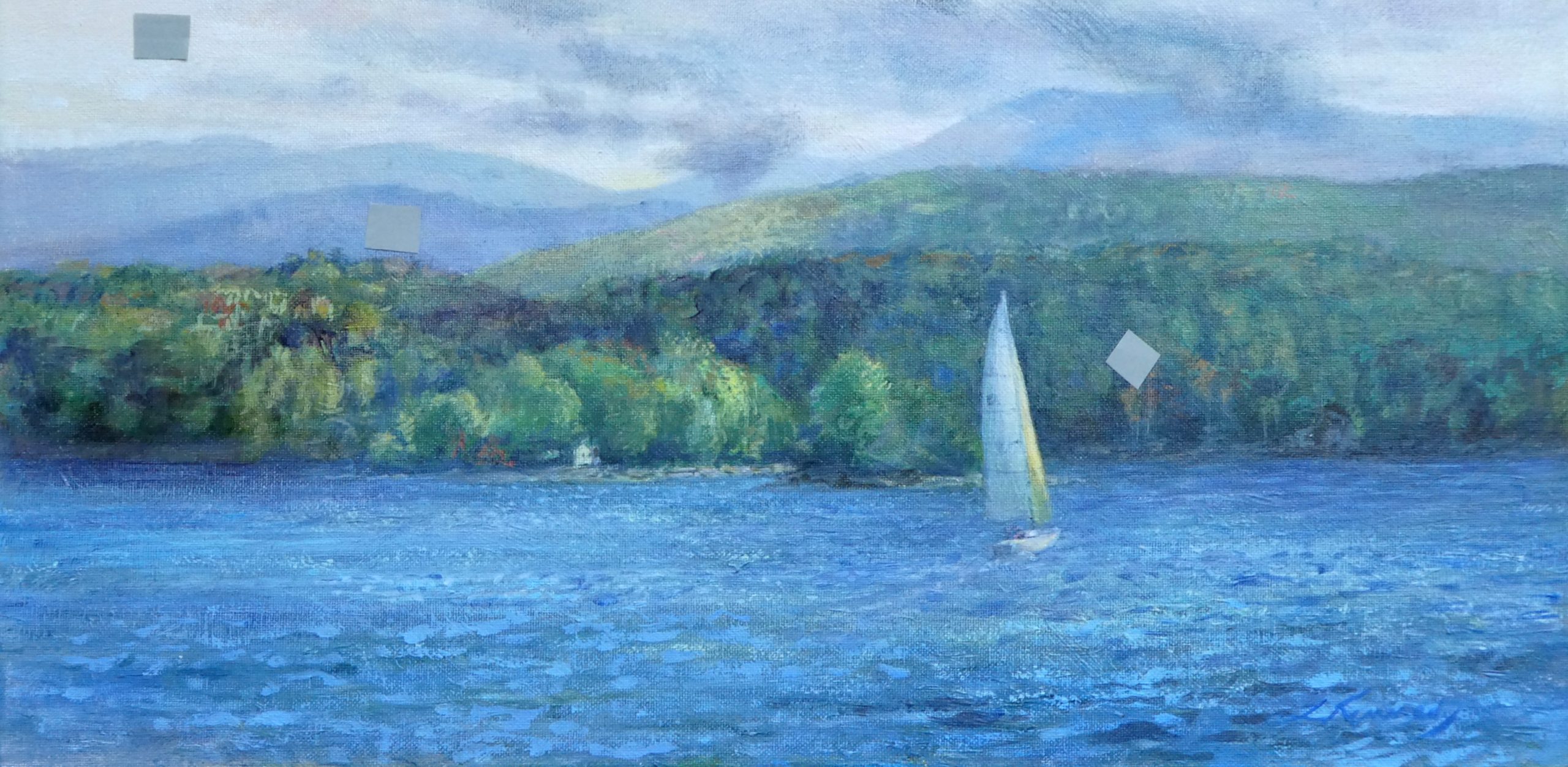
Note the three gray squares and how (due to the law of simultaneous contrast) they appear to be different from one another.
They are all the same.
acrylic on canvas board 10″X20″ Lillian Kennedy
(click on image to enlarge)

Painting can drive you crazy. When you look at the dark square in the sky, it looks like it would blend into the dark area of the trees. If you put it there, it’s going to be way too light. Anticipating this will save frustration.

In a landscape you are painting, the leaf highlights may be darker than the shadows in the clouds, but it won’t look that way. We are tricked. One can think that highlights in the foliage of a tree are white because they look so light. And you might think the underbellies of the clouds are quite dark. You will break the masses of your larger shapes if you aren’t careful.

The color that you put in your artwork will appear lighter or darker, brighter or duller, and more or less intense based on the colors around it. That’s the Law of Simultaneous Contrast in Color. You can spend a lot of time “fixing” a color when what you really need to do, to get the effect that you want, is to change the colors around it. Eugene Delacroix (French 1798-1863) said, “I can paint you the skin of Venus with mud, provided you let me surround it as I will.”

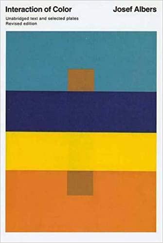
In the above book cover, use your fingers to block out the deep blue and bright yellow strips in the middle in order to see that the two brown squares are the same color. The Interaction of Color by Joseph Albers includes this exercise; take two pieces of the same color and try to push the contrasts of hue, value and intensity to make the squares look as though they aren’t identical. You achieve this by surrounding the squares with colors that push in opposite directions. Try this at home. You can even use torn pieces of color from magazine illustrations and ads. Suggest it as a party game to enhance your social distancing… unless you have visually obsessed friends.

In the cover example the top square looks warmer, lighter, and more intense because the blue is cool, dark, and less intense (bright / saturated). The bottom square looks darker, duller, and slightly cooler. Why? Remember — in simultaneous contrast each color pushes it’s neighbor in the opposite direction.

The reverse of that exercise is to take two squares that are different colors. Have them be slightly different in hue, value, and intensity. Try to make them look identical by carefully surrounding each of them with colors that will push them towards each other.

Gather a few different values of gray on bits of paper. Guess what they will match when held against an old master painting (either online or in an art book). Hold the paper close to see if you got it.

After making some extreme miscalculations this week when a color looked perfect on the palette and yet missed the mark by a mile on the canvas, I thought I’d share this concept so that when/if you experience it you’ll know that you have lots of company. Paint away and enjoy the challenging ride.!

Reminding you that all the old Weekly Art Lessons are archived above as well as the Staycation Series. There is some good stuff there.

This entry was posted in Staycation Series. Bookmark the permalink.

13 Responses to Satycation Art #11: Don’t be Fooled by Simultaneous Contrast!

  1. Marilyn S. Stalzer says:

    The push / pull of colors seems to be also a part of ones eyes. Interpretation of color choices to be pleasing or not so much depends on personal feelings while looking. These change hourly in my experience.

  2. Bob Turner says:

    I love your interesting description of a blending of art and science. Looking forward to seeing you in action soon.

    • Lillian Kennedy says:

      Hi Bob, I missed you here at the Lake just this morning when I slipped away with my paints at 6:30 am and glanced, out of habit, at the spot where you sit in the early morning to watch the birds. I wanted to say HI to you then and won’t miss the chance now.

  3. Yes, in the archived posts, “there is some good stuff there”! I have been thinking of printing out these lessons so I can refer to them over time. I really think you should write an art instruction book! You have so much knowledge.

    Although I had seen Albers’ Interaction of Color before, this is a lesson that is always astounding. How different a color can look depending upon what surrounds it!

    Every color we paint changes depending upon the other colors around it. Wow! Thanks for another great weekly lesson to keep us busy for the rest of our lives.

    • Lillian Kennedy says:

      The whole shebang with painting is going to keep us busy for the rest of our lives for sure. I’ve been at the “art thing”, especially landscapes, since I was a little girl in the 50s. I “know” more now (i.e. simultaneous contrast), but it has NEVER become easy. It is always a lesson in uncertainty!

  4. Kathy Felder says:

    Initially I couldn’t find all three squares in the painting! “Simultaneous contrast” gives me a new way of thinking about so many things going on right now. Thank you for helping me.

    • Lillian Kennedy says:

      Hi Kathy, Thanks for your comment. Simultaneous contrast does happen in all areas, not just vision. If we eat something really sweet and then eat an apple, the apple doesn’t taste sweet. There is science behind it. Psychology as well! Miss you and hope to see you soonish. Stay healthy!

  5. Carol Wellein says:

    I can only see 2 squares unless the little house is one. Can you point them out to me?
    Thank you.

    • Lillian Kennedy says:

      Hi Carol, The third square is below and to the right of the square in the sky. It is the same value as the blue mountain that it tops. Do you see it now? Thanks for asking. A lot of people had trouble with that one.

      • Carol Wellein says:

        Thank you Lillian. Got it now. My grandkids recently showed me the same thing on a kids show they were watching. They thought it was magic! I’m enjoying your weekly art lessons. Thanks so much for helping us get through a difficult time!

  6. Carol Wellein says:

    Thank you Lillian. Got it now. My grandkids recently showed me the same thing on a kids show they were watching. They thought it was magic! I’m enjoying your weekly art lessons. Thanks so much for helping us get through a difficult time!

    • Lillian Kennedy says:

      Hi Carol, Tell your Grandkids that I think it’s magic too! Even when understanding the “why”, it remains just as amazing. And thank you for your comments.

Leave a Reply

Your email address will not be published. Required fields are marked *