Staycation Art Series #13: The Space Between Things / Negative Shapes in Art

There can be beauty in the space between things. Those shapes are called “negative” and they can help you draw the “positive” shapes of your subject.

Do you see the shape of the space that isn’t what you think you are painting or drawing?

These shapes can have evocative elegance and add to the rhythm and definition of your subject, but the primary reason to learn to observe them carefully is that by doing so you can much better see the shapes of the things you think of as your subject.

The pencil drawing above shows the shape of the space between the rose blossom, it’s stem, and the top leaf. It also shows the shape of the highlight on the petal above. Train to analyze shapes abstractly without thinking about what they represent.
Draw it yourself paying attention to both positive and negative shapes.

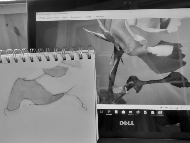
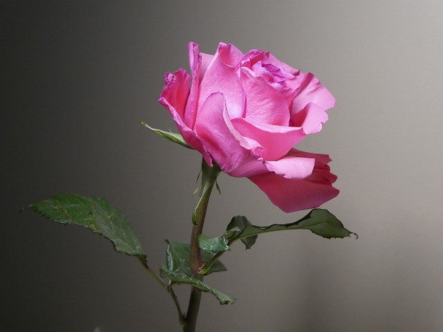
To assess negative shapes, ask yourself questions such as “What is the longest dimension?” or “What is the angle of this line?” Hold your pencil up in front of you to match the angle or measure the length compared to the width (details on how to do this will be covered in the next lesson).

Draw the shapes of the white areas. Stay relaxed and do it for fun, not to make a great drawing. It’s an exercise. Let your lines be squiggly. It’s just another way of looking.
This entry was posted in Staycation Series. Bookmark the permalink.

2 Responses to Staycation Art Series #13: The Space Between Things / Negative Shapes in Art

  1. Thanks for another great lesson. A good idea to draw what is not our focus! What beautiful abstract shapes lie in those negative spaces. Another good tip to wake up our drawing skills.

  2. Ilene Rubin says:

    This was wonderful! I tend to make things up and zoom in and zoom out in my paintings, and then wonder why they didn’t turn out as I’d hoped. When I force myself to ‘see’ and go through the exercise of paying attention to that, especially in still lifes, I’m happier with the results. Seeing the spaces between is a great reminder that interpretation is great, so long as it’s based on proportion and perspective. For my representational art, it’s indispensable. Thanks, as always, for spot on and timely posts.

Leave a Reply

Your email address will not be published. Required fields are marked *