One Artist’s Favorite Use of the Color Orange (Online art lesson #39)

Happy Halloween from Lillian Kennedy at the Weekly Art Lesson

Happy Halloween from Lillian Kennedy at the Weekly Art Lesson

Happy Halloween.

From the in-your-face intensity of traffic cones to the mellow tones of terracotta, orange affects us in vastly different ways.

Awaken your senses to orange.   You’ll find saffron, brick, peach, rust,  tangerine, papaya, and so much more.  This is the season to look for orange variants in nature.

Today all of us will be seeing orange.  Although we’ll be seeing it paired with black, its most intriguing relationship is with its complement, blue.

Placed side by side orange and blue enhance the apparent brightness of each other, but mixed together, they create grey.  That’s the way it is with complements.

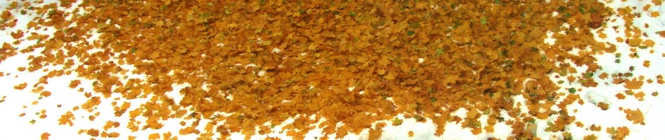
Assignment: Take a look at these illustrations of cadmium orange mixed with cobalt blue. Practice mixing orange with the different blues that you keep on your palette.  If you don’t have orange, you can mix red and yellow to get it.  Pay attention to the differences in all the mixtures. Note how they make you feel.

cadmium orange and cobalt blue mixed for grey.  Lillian Kennedy Weekly Art Lesson

cadmium orange and cobalt blue mixed for grey. Lillian Kennedy Weekly Art Lesson

cadmium orange and cobalt blue mixed for grey.  Lillian Kennedy Weekly Art Lesson

If you want to mute an orange , you can add blue.  If you want to lower the intensity of blue, add orange.

If you just want a great grey, join these two together.  You don’t need a black to get grey.  You will achieve subtle and sensitive greys by using complements.

And so, when thinking of painting a sky, I generally think of orange.  It works in the clear blue and in the clouds too.

Learn more about orange.

  • “Orange is red brought nearer to humanity by yellow.” — Wassily Kandinsky
      • “Orange is the happiest color.” — Frank Sinatra
Lillian Kennedy - about Orange

Celebrating Orange...It looks like a Halloween costume, but the eye patch is from cataract surgery.


ATTENTION!  The bucks are rolling in. Check them out : How Any Artist Can Make a Few Bucks Before Breakfast (Online art lesson #38)


orange weeklyartlesson

Orange Arc under the garden maple after the storm.


This entry was posted in Weekly Art Lessons 31-40. Bookmark the permalink.

7 Responses to One Artist’s Favorite Use of the Color Orange (Online art lesson #39)

  1. Knock Knock–Who’s There?
    Orange!
    Orange Who?
    Orange you glad it’s me?!

    –I have recently discovered the amazing relationship of orange and blue. There is something about these complementary colors used next to each other that is far more pleasing than other complements together. At least, that is this artist’s humble opinion. However, I do think that yellow and purple come behind in a close 2nd.

    OH! …and I disagree with Frank Sinatra–I think yellow is the happiest color! To each his own, I guess!

    I’m glad you came through this eye surgery so well. I am praying that you will have much success with this and be able to see the very best you possibly can.

    Happy Halloween, Lilly!

    • Lillian Kennedy says:

      If only you knew (although you could guess) how much I wanted to incorporate that joke into the post!
      I would love to know WHAT yellow and WHAT purple you like to work with as complements. I sometimes use them together, but they seem much trickier to me. Thanks. Lill

      • Well, I am not the master of color that you are! …or even other artists!! 🙂 …but it’s the warmer tints of lavenders/light purples and yellows that I really like together. Here is a link to one of my favorite paintings that I have done using the warmer complements together http://fineartamerica.com/featured/sun-kissed-beauties-margaret-bobb.html

        Also, I did an abstracted painting in a plein air workshop last year that incorporated at least two tints of cad yellow light and cad yellow medium with varying tones of dioxizine purple of which some is mixed with Alizarin. One of my classmates said, “OH! …the colors in there just SING!” Of course, being a musician, that just made me soooo pleased. Here’s a link to see that piece http://fineartamerica.com/featured/rabbit-brush-abstracted-margaret-bobb.html

        I’m remembering one of my favorite paintings of YOURS where you painted Alberta Falls in RMNP, and you incorporated a lot of purples and yellows as I recall. I LOVE that painting! I’m pretty sure that it is my all-time favorite ever. Just thinking about it makes me happy.

        • Lillian Kennedy says:

          Thanks for such a detailed answer, and a treat to follow your links. by the way, I agree with you about yellow being the happiest color- what was Frank thinking?

          • You’re welcome! …so what are YOUR two favorite complementary colors together? …and do you find yourself often incoporating them into your paintings without even really thinking about it?

  2. oops…incorporating! 🙂

  3. Jean in NH says:

    Awhile back a number of quilters were using blue and orange side by side. It looked so good that I’ve been saving up blue and orange fabrics to also use in a quilt.

Leave a Reply

Your email address will not be published. Required fields are marked *