Mixing Ireland’s Forty Shades of Green (On-line art lesson #11)

www.LillianKennedy.com
Lillian@Rockfire.com

Johnny Cash is responsible for our talk about “Ireland’s forty shades of green”.  He counted low.

  • Watch the video
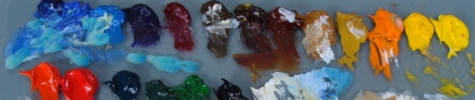
  • Get out your paints in whatever media you use.
  • MIX  (try new combinations), and PAY ATTENTION while you are mixing.
  • See if you can learn to anticipate what the results will be – this is the skill you are after!!
Howard Fischer painting in Club Tues. class, Boulder, CO, Lillian Kennedy

Howard Fischer painting in Club Tues. class, Boulder, CO, Lillian Kennedy

Ann Hayes at work in Lillian's Boulder Studio.

Ann Hayes at work in Lillian's Boulder Studio.

Aren’t you curious about what is painted on these canvases?

This entry was posted in Weekly Art Lessons 11-20. Bookmark the permalink.

8 Responses to Mixing Ireland’s Forty Shades of Green (On-line art lesson #11)

  1. Waaaaaay Cool! …and waaaaaay Warm! (Cool and Warm greens!) Plus just waaaaay nifty! I will be doing this exercise and documenting how much of each color I mix so that I can replicate it! Thanks, Lillly!

  2. Ann Hayes says:

    I am JAZZED on greens, doing the River Dance here while I dig, delve, and smear with the palette knife making 40,000 greens with nary a green in my cast of colors. Is this a combination of Irish alchemy and spring fever or what?
    Ann Hayes

  3. Mike Reynolds says:

    This one is great too! It really bring home how easy it is to mix colors. And, green is always the hardest, I think. I still haven’t finished my project, but I have another thing I have to finish quickly, so it may not be done tomorrow either. But you are difinitely on a roll. Keep going!

  4. Ilene says:

    Thanks, this was great! I love the music, I love how easily and quickly this created a mosaic of color and I just LOVE knowing now that I don’t have to simply depend on straight color. How clever not to include a green on the palette. Please do tell, what was the purpose of the black paper next to the white paper? Was that on purpose or random?

    • Lillian Kennedy says:

      Ilene,
      Thanks for the question. The black had a purpose, but it didn’t work. In “real” life, the greens looked so different on the white from on the black papers. I was trying to sneak in a bit of an eye opener on simultaneous contrast in color. It didn’t show in the video, but I’ll get in in another one.

  5. Pingback: How Well do You See Color? (Online art lesson #37) | weeklyartlesson.com

  6. Pingback: How to Draw an Ellipse: Linear Perspective Part II (Online art lesson #53) | weeklyartlesson.com

Leave a Reply

Your email address will not be published. Required fields are marked *