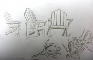
If you’ve tried the Adirondack chair drawing assignment , you’ve probably come to the conclusion that they are more devilish than they first appear to be. Keep practicing! If you email me an image of your chair studies, I will add them to the bottom of this post.
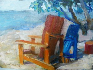
Nyla Witmore sent this little piece. (To see her gallery work, click on her name.)
This was fun and I did it without a beer or martini. (It took longer however.) I like to give myself a challenge in terms of a “theme” or parameters to explore. In this case, I was working to create a color theme which leaned toward a Blue/Orange complimentary color scheme….using Ultramarine Blue, Cadmium Orange, Lemon Yellow, Alizarine, and Transparent Red Oxide plus white. I changed the color of the all blue chairs in Lillian’s photo and rearranged the tree and ocean.(Someone told me that artists are allowed to “play God.” ) At one point I added a buoy to the left of the orange chair hoping to balance the composition, but it looked too “hokey.” Since it was just an exercise and not a painting for the gallery, I decided to let it be.
You can use Nyla as a role model – just email the chairs you have been doing and I’ll share them here. In the meantime, here are two more photos from the shore here on Thompson’s Point.
Note: This is not one of the Weekly Lessons – it’s just a nudge to get you into your studio.
This will help you with the linear perspective involved.


Pingback: How to Draw an Adirondack Chair (Online art lesson #26) | weeklyartlesson.com