COLOR: Beware of Preconceptions (Online art lesson #35)

Our ideas about a color differ from what the eye really sees, and we’re generally convinced that these preconceptions are accurate.  Use the following technique to isolate and evaluate color.

To access colors that are at a distance, look through a spot finder to isolate the color from your preconceptions of the color  weekly art lesson.com  Lillian Kennedy

To evaluate a color, look through a spot finder to separate it from your preconceptions about the subject.

We humans are pretty smart.  We know that the tree in front of us is the same color as the tree of the same species on the distant mountain. Knowing this makes survival easier.  Imagine if we looked out and gasped, “Holy smoke, look at that hillside covered in pale bluish purple  trees! Those must be really strange  trees!” In order to be productive and effective, we have learned to interpret the distant color as the same as the near color.

We identify an object and decide that we know what color it is.  This is useful in daily life, but not in painting.  The colors that we actually see vary a great deal depending on light, shadow, atmosphere, distance, and reflections.

To check this out, put a small hole in the middle of grey paper. Fully extend the arm holding the paper. Close one eye and use the other eye to look through the hole.   When you eliminate the visual clues about what the subject is, you can study the color alone.  Ask yourself, “If I had no idea  what this color was attached to, how would I describe it?”

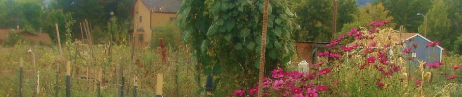
Last week I took a class plein air painting  in Boulder’s community gardens.

What color do you think those distant trees on the mountain are when you’re standing right in front of them?  If you paint them that color instead of the color that you see, they won’t appear to recede.

In my effort to explain this concept, I grabbed the lid from my take-out coffee.  It worked well for the purpose:  So, if you don’t want to make a hole in the middle of grey paper,  try this when you get your next coffee to-go.

Naw,  no one will think you’re weird if you look  through the little sip hole  exclaiming, “Wow – the trees really are blue!”.

This entry was posted in Weekly Art Lessons 31-40. Bookmark the permalink.

12 Responses to COLOR: Beware of Preconceptions (Online art lesson #35)

  1. Hi Lilly! …I’ve been “studying” this concept this week. Yep–it works! This is really cool. I know it will help me make better landscapes. Thanks!

  2. Jean in NH says:

    Interesting and helpful.

  3. Janette Rozene says:

    Some art students once explained this to me that there are layers of atmosphere between where you stand and objects in the far distance, like veils of water. Each layer makes the distance more violet. So you must be careful to make the black tree that is miles away much lighter and bluer in color than the black root at your feet. Save the pure rich color for the foreground. The green tree on the mountain thus becomes blue violet when it is far away and only green when it is nearby. Take a walk early in the morning, look at the color of an object in the distance and quickly compare to the same color right at your feet so your mind will not trick you into painting them the same color. Thanks Lillian for another great lesson!

    • Lillian Kennedy says:

      Janette,
      Thanks for sharing. You’ve brought up atmospheric perspective and explained it well. It took me a long time to learn to see it. It was in Frank Mason’s Vermont class that I first started to learn to SEE this.

  4. Nyla Witmore says:

    Who knew that probably one of the best views of the flatirons from the community grow-your-own- gardens would be better than alot of postcards….the house in the distance looked like it could have been in France. SOOO charming. Who wants to paint only the “postcard” views. Your weekly lessons are so informative and you express yourself soooooooooooooo well.

    Maybe another weekly lesson topic could be about choosing views that are not the cliche “postcard” views—to keep us seeking out the “more artistic and appealing” views.

    • Lillian Kennedy says:

      Hi Nyla! I often walk to Vic’s and always pass through the community gardens. The angle is similar to what used to be the back fields of Long’s Iris gardens. There is always so much activity is the community gardens that it makes the scene lively and interesting. There are some great shaded areas that you can work from there. I certainly have done the “postcard” views of the Flatirons … that choice had a lot to do with the market/ income.

  5. Tisha says:

    A wonderful class and yes Nyla is right it was very reminiscent of France. Thank you for the peephole tool idea. Sometimes the natural outdoor beauty is so daunting and vast that you don’t know were to start . Focusing through the peephole not only helps distinguish color, but you can start to focus on the tool at hand and build a small imaginary frame around a specific area you wish to work on. I find that this helps my process and I waste less emotion on being overwhelmed. All that excitement and energy when I get to the site can then dive into the canvas.

    • Lillian Kennedy says:

      Oh Tisha, And you do have SO much passion and energy in your painting. I find it difficult to contain sometimes too. I actually feel visually greedy – my eyes want to eat up every beautiful spot.

  6. Pingback: How Well do You See Color? (Online art lesson #37) | weeklyartlesson.com

  7. Tamilou says:

    What a great idea! I can’t wait to try it out. Thanks Lillian.

  8. Pingback: Aerial Perspective – The Atmosphere That Keeps You and Your Paintings Alive (Online art lesson # 61) | weeklyartlesson.com

Leave a Reply

Your email address will not be published. Required fields are marked *