In part 1: Putting People in the Landscape, we covered scale, proportion, and gesture. In this lesson we will consider three more aspects of populating (or staffing) your landscapes: 1. Make sure that your figures are subordinated to the “whole”. 2. Make your figures useful; they are a compositional tool. 3. Make your figures look like they are able to get up and move.

1. Make sure that your figures are subordinated to the “whole”. Many of my favorite old master landscape painters tucked figures into their paintings, but the figures are not what you first notice when you catch a glimpse of their paintings. You see a grand landscape infused with light and air. It’s only when you step closer that you notice the people. They are placed perfectly to lead your eye around the painting, and they tell a story.
Check out this painting by Sanford Gifford (1823 -1880) and be sure to use the zoom tab to really see the details. This is only one of hundreds of paintings that I would like to show you.
People, trees, rocks … the whole kit and caboodle, are all enveloped in the same atmosphere and illuminated by the same sun. See and paint the “oneness” and understand that people are simple one of the many elements in that whole.
2. Make your figures useful; they are a compositional tool. Your figures will attract attention to themselves. We may even bend in close to take a further look at them. Because we’re human, we instinctively want to assess other people. Therefore, figures can be a powerful tool to use in creating a composition. (At this point, it’s sounding a tad kinky… USE your figures and make them SUBSERVIENT.)
Place the figures to aid in the movement of the eye through your painting. Decide where you want the viewer to look and for how long. Some methods to hold a viewers attention:
- Increase the saturation (intensity) and contrast (value changes) of their clothing against the background.
- String a few out along an imagined line to move the eye through an area.
- Put emphasis on one and not another for more subtle layering of movement.
You are choreographing your painting in an imagined space. You are conducting an orchestra: the notes, the length of the notes, the blending or emphasis of the notes. Where do you want to show scale? Lead the eye? Decide how your figures can best serve you.
Of course, it’s not just figures that you want to use and control. All the elements, or details, that fill your composition serve multiple purposes. But figures are especially important and even small ones capture attention and hold the eye longer than, say, a bush at the same scale with the same amount of contrast.
3. Make your figures look like they are able to get up and move. All the figures need to be doing something, even if it’s sleeping. They all have itches and tensions just like you and I. Know them to be real not just a devise to bring a bit of color into an area. Feel them as you would feel yourself if you were in their situation. We humans are all woven of similar fabric.
Painted stiffly, your peeps will appear awkward and out of place. Notice if your body tension changes when you paint them. If it does, that will likely cause a problem in the painting. Relax. Try them different ways to get comfortable.
Paint them so that they appear to be able to move around in your painting just as you want the clouds to appear to be able to move across the sky.
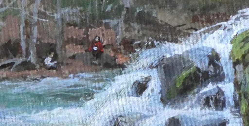
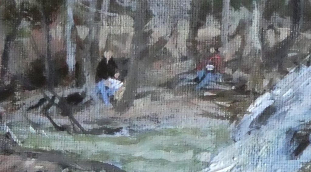
The socially distanced sketchers I imagined in Staycation Lesson 2 actually did get up and move around. Here are two earlier versions. They even brought an imaginary change of clothes. Check out the final figures too. It’s not that I like the final figures more, it’s that all elements where fluid as I worked.


