Too much information is NOT a good thing. But how to simplify?

BERNARD P HUANG photo of Lillian Kennedy in the Brooklyn Botanic Garden with her Mother-in-law, Magda Feuerstein. click on this / all photos to enlarge
I want to share this, and this, and that, and oh my, this over here too! I think about you all a lot, but I don’t publish on time because I haven’t learned to simplify in writing the way I have in painting.
Everything glitters, catches my attention, and begs to be included. It all seems important and relevant. I start out including too much in one post. But each lesson needs to focus on one thing. It can be so overwhelming that nothing gets published because of the complexity.
Doesn’t this sound like painting? Too much information is NOT a good thing.
You finally choose one thing, but that thing can be broken down into an infinite number of things – and so on.
It’s not about narrowing your field of vision. It’s about creating a WHOLE through subtle adjustments and holding onto your chosen vision.
Assignment: Go out into nature with your art supplies. Sit, look, and do studies.

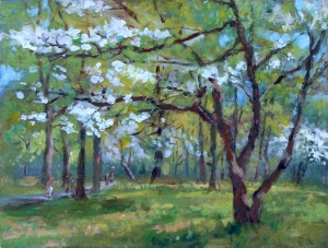
9x12 acrylic plein air landscape painting, Lillian Kennedy, Dogwood in Alley Pond Park, Queens, NYC April, 2012
Stay in this stage until you can see your composition as one beautiful whole that rhythmically moves you around and lets you rest at your focal point. See the scene as one great space. Not a collection of parts – a unified whole. Let this happen organically through your contemplation, studies, feelings, and thinking.
You won’t get your painting /drawing to be perceived as a whole if you haven’t first really felt the scene as a whole. All things are connected. The same atmosphere and light envelops the multitude. Choose that one thing is that you really want to express and let the other fascinating glittering areas be subordinated – and don’t let that focal point fracture “the whole”. Let me know how it goes. It is natural to want to put in everything.
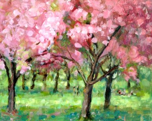
As an example of this kind of subordination, enlarge the paintings here and note the people in each one. These paintings are not about any particular Joe or Susie, they are about the dogwood and cherry trees. Too much information about the people would be distracting, especially at this scale for plein air work. And with this post – I decided not to stew over the fact that the images of these paintings are “off” in terms of color harmonies. My color is not the point of the lesson.
Simplification is actually very complicated.

